What
Redesign the sign in/up flow to reduce the bounce rate, improve conversion rate and reduce the creation of multiple accounts on an over 14 million user platform.
Who
While I focused on user research, testing and design, I worked along side with a Project Manager, the Android and iOS Developer teams.
How
Competitive and comparative analysis, Usertesting.com on previous design, qualitative research, usability testing on new designs.
Tools: usertesting.com, leanplum, google analytics, sketch, craigslist
Overview
Udemy’s mobile app was experiencing a bounce rate of 28% upon download. In addition, web first users were mistakenly creating multiple accounts when logging into the app leading to an overwhelming number of support tickets. We had a clear understanding that in order to create a good cross-platform experience users needed to create a Udemy account or be able to login into their existing account without friction.
Process
Research:
I went back and digged up the research on all previous attempts to fix this problem in the past. My first week was spent understanding what was wrong with it and developing hypothesis on what could be better.
Hypothesis:
First time users do not understand the value proposition before creating an account. Returning users often create multiple accounts by mistake due to confusing copy. Lack of error feedback makes it difficult to know when you've made a mistake.
Validation:
I conducted user testing on the current design to learn and validate my hypothesis. Taking to our users was helpful, but I felt I was missing part of the story, so I also reached out to the support team in search for more answers. It turns out that they had heard many of the issues I was trying to address from our existing users. This is what I learned from it:
- New users did not know what the app was about by just looking at the sign in/splash screen
- Most wanted to browse or learn more before moving forward
- Ambiguous copy made users confused about what action to take next
- As shown in the flow, sign up and sign processes are similar enough to get users confused as to in which they are.
Design:
I went ahead and mapped the flow addressing the copy on the buttons, all entry points and separating sign in from sign up in a way that was more clear to understand. I got great internal feedback on it, but also a suggestion to focus on the screens before the signup screen (on-boarding, non existent at that point)
On-boarding Design:
After juggling with at least 15 wireframe versions I picked 3 that captured all the main ideas that I wanted to test. The first one had little information and users were dropped right into the app, the second offered a bit more context and the third really stated the value proposition of the app. All three followed with somewhat similar signin/up flows that were meant to test friction.
User testing:
With the research team being tied up, I offered to take on the recruiting and research. I recruited 6 candidates that had never heard of Udemy, and the main goal was to evaluate whether or not they would be able to tell me what Udemy was from the first screens and if that created enough value for them to create an account (addressing the bounce and conversion rates). This is what I learned:
- Provide little information and users will drop when confronted with signup as the only option
- If users get dropped right in the app, they will feel overwhelmed and likely drop
- Giving a snapshot of what to expect is most successful; however, actual UI screenshots tend to confuse the user rather than aid their onboarding. Users are more responsive to abstract, easier to digest information
- Most users don't differentiate sign in from sign up
- 100% of the users I tested avoided signing up with social media
Design:
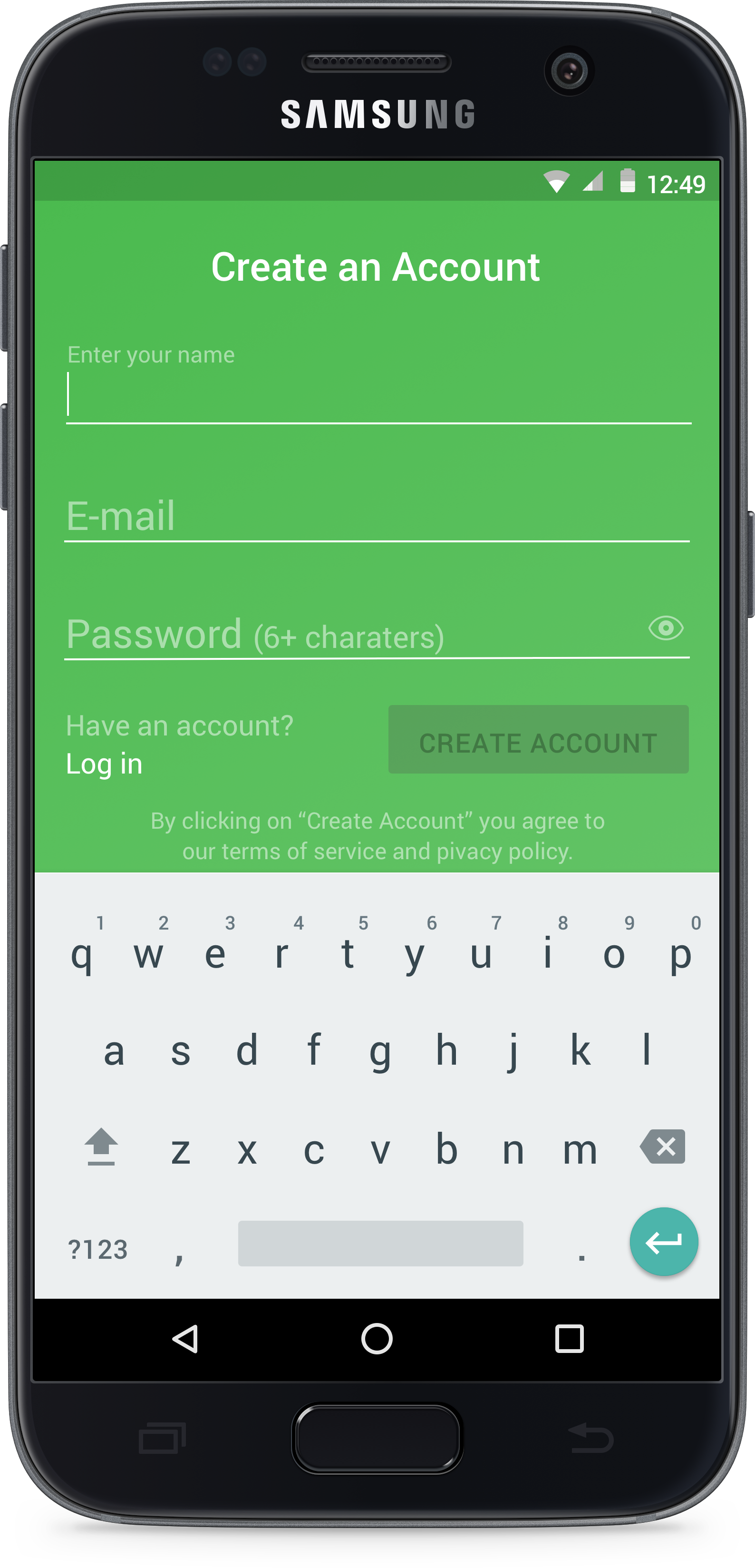
This is one of the first designs I presented. The intention was to combine some brand colors and create a more soothing experience. What I didn't realize was that while this was more in line with current trends, it didn't fit the product as a whole. On the second solution I opted for a slight gradient, combining the brand green with another shade used specifically on mobile. The result was a much cleaner UI that did not feel completely disconected from the product.


