A MOBILE SOLUTION TO ATTRACT MILLENNIALS TO THE SYMPHONY
Concerto allows users to listen to upcoming artists, learn more about classic music and find tickets for their shows.
LISTEN
Shuffle artists, composers and playlists and
get suggestions on upcoming concerts.
LEARN
More about the artists that interest you. While listening to upcoming performers, you are able to read fun facts, history and their background.
BUY TICKETS
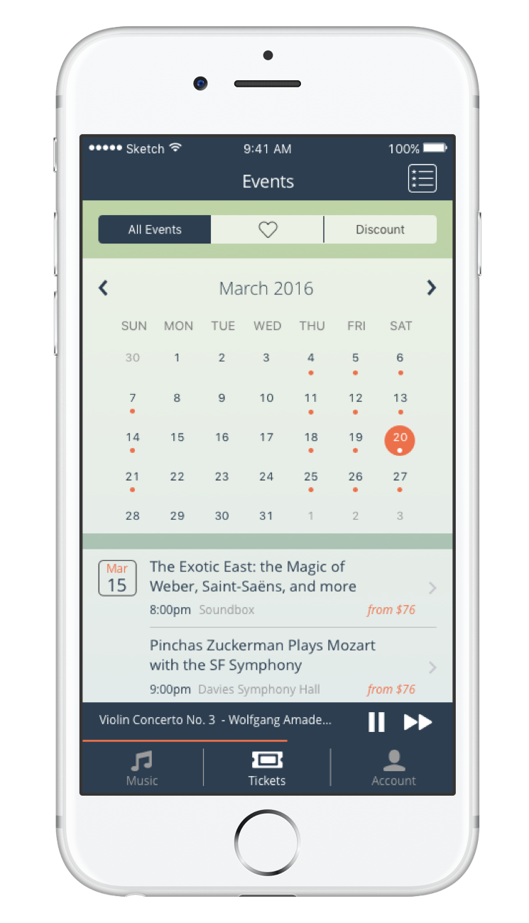
Discover your favorite artist, search by date, favorited styles and discounted tickets, all this while you listen to classical music
WHAT
The San Francisco Symphony is looking ahead and is trying to find solutions to retain the interest of younger audiences.
WHO
The project consisted of 3 UX Designers, collaborating through the research, and site architecture. I had a stronger focus in the wireframing and prototyping of the project. The whole project lasted 2 weeks.
HOW
User Interviews, Surveys, Competitive Research, User testing.
Sketch3, Sketch Mirror, Google docs (for collaboration).
OVERVIEW
How do we get them kids in?
The SFS current attendance has seen a slight decline over the years, this made them realize that while they have a loyal customer base, the future of the Symphony is somewhat uncertain as younger generations do not show the same interest in classical music. The SFS has made an attempt to reach out to a younger audience by creating a bar like atmosphere with their Soundbox venue; however, they still haven't been able to capture the core of their target audience. This is where we come in, in order to fix this we designed a classical music discovery tool that would facilitate ticket buying while aiding the users in finding out more about the experience and the composers.
PROCESS
Affinity mapping and user flows
To get the feel of what we were getting into, we started with interviewing three potential users, an experienced, an intermediate and a beginner level symphony goer. This helped us understand our target audience and develop a survey.
Through the survey we were able to understand patterns of attendance, motives and habits of our users as well as what features they relate to. With this information in hand we brainstormed and analyzed what our app would consist of. The entire research consisted of analyzing 6 other symphonies in different states and their programs , 3 one on one interviews with different level users, surveys and user testing.
Final iteration of our sketches
Digesting the information became easier as we started some rough sketches. After we were settled on what information we wanted, we conducted 3 user testings using paper prototypes this helped us identify buttons and functionality that was confusing to the users. Once the problems were identified and ironed out, I got started on the wireframes and prototype. Through the process we tested an additional 4 potential users and made several iterations on what you see today is the final version.
Final Wireframes
DESIGN
It's not just about buying tickets
The main goal of the symphony is to get millennials to buy tickets, our goal was to create an engaging experience that could be repeated time after time. A music discovery app that facilitates learning and lures you into upcoming events it's exactly what they need.
Listen
We learned that millennials are most drawn to performances after listening to music. By allowing a shuffling option that also provides suggestions on upcoming concerts we are able to capture the essence of attending live performances.
Learn
Reason number two of why millennials did not attend the symphony was because lack of information. While listening to upcoming performers, you are able to read fun facts, history and background of the composers. Also, you are able to preview composers before buying tickets. More informative, more compelling.
Buy Tickets
Finally, to complete the experience, ticket buying. On these screens you are able to see upcoming artists, those that you previously liked and most important of all, discounted tickets. By providing pricing information upfront users did not feel tricked or disappointed at the time of check out encouraging the ticket buying process.
By combining these three tools we designed an app that is not only easy to use but that it also addresses the needs of those in search for classical music but that have limited knowledge, time or income to experience it otherwise. As we promoted it during the presentation, "Add a track to your day'.
LOOKING BACK
Our initial intention was to create a one stop shop for the symphony and while it wasn't easy, we learned to let go. We had a hundred ways to go about finding a solution for the symphony, sometimes the process seemed long and tedious but we always felt rewarded by our work. We settled for simplicity, and in the end, it paid off.


