
Explicit Signal Collection
Improving engagement through personalization

Team
Product Designer 👈
Product Manager
4 Engineers (including iOS + Android)
Problem
Free-trialers that join Skillshare organically, land on a non-personalized member home. This cold-start experience serves recommendations that rely on class quality and popularity; however, they don’t always match members’ interests resulting in low engagement.
Based on data analysis, members that do not watch >3 lessons of a class within their first 3 days, are less likely to convert to premium after their free trial.

Approach
This project was led by the discovery pod, acting as a subsidiary for the growth pod. So from the get-go we treated this project as a test that could be iterated on. The team agreed on the following areas of focus to measure success.
Help students find their first class on their first session
KPI - # of students that watch 3 lessons in their first 3 days.
Improve free-to-paid conversion
KPI - # of students that convert to premium
Build on what is working

We had previously tested a mild form of personalization that takes place by collecting implicit signals from users that convert through influencer channels.
While this does not fuel the recommendations algorithm in its entirety, it does help us surface 3 relevant classes based on the channel tags.
This method proved successful in matching students with a class within their first three days and helped improve the free-to-paid funnel. We want to expand on this test so it also covers all non-influencer traffic.
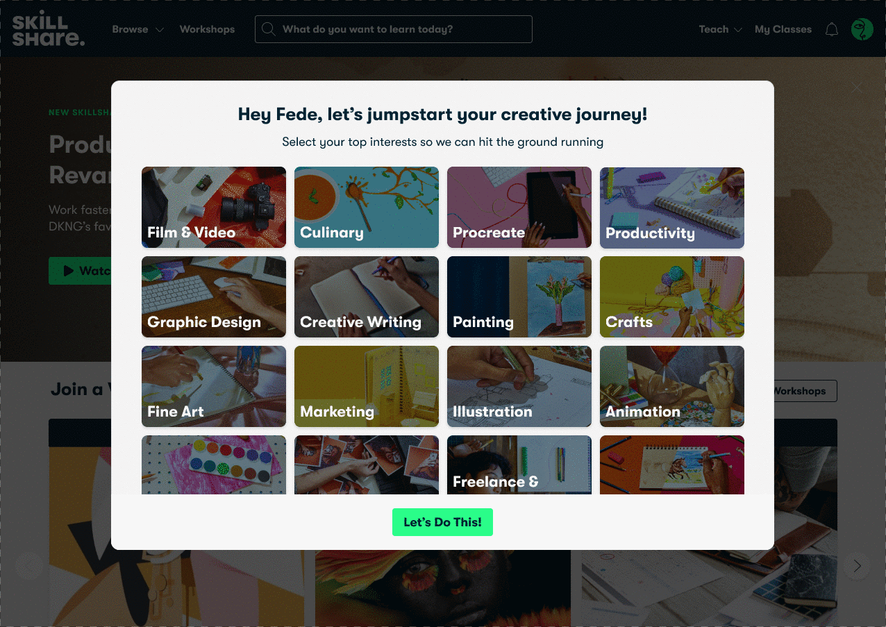
Collecting the right signals
Using the existing taxonomy served well for explorations; however, our skill taxonomy has not evolved in a few years and
no longer represents the most relevant terms in the industry.
We workshopped with cross-functional partners (personalization, growth and content teams) to work on defining which tags should be included and which ones shouldn’t.
The result is a blend of 28 popular search terms, skill categories and implicit signals that best represent our catalog and
student preferences.
For example, illustration is broad enough and might yield relevant results but Procreate is a “hot” term that could help us get students to what they are looking for way faster.
Help users without getting in their way
We focused on building on the existing collection of implicit signals from influencer channels. The goal is that no matter where the user is coming from, we’ll have a way to surface personalized content.

Discovering the most efficient way
to present categories.
Through multiple iteration user testing we uncovered which patterns worked and which didn’t. Ultimately, using a modal and being able to see the next step was the clear winner.

Designing for flexibility
We tried a number of options for how to present skill categories to users, ultimately we decided on a modal for a number of reasons.
Flexibility of Placement
The first test was to place category selection after checkout but in the future, we wanted to test alternate placements.
The end in sight
Knowing that they are one step away from a personalized experience encourages users to complete the task at hand. It also gives us room to add personalization cues through the page loading in the background.
Multi-step onboarding
We have plans for evolving this experience and as such, we built it in a way that could grow as needed.
Delight with Microinteractions
Interactions created with Figma
Brand forward
I collaborated with the brand team to bring category skills to life. We created assets that would be specific enough to help users with their selection but flexible enough to reuse in marketing campaigns.

Web + apps
This is the first time at skillshare where all three platforms got prioritized on a feature launch. This added technical complexity to the project and there were a lot of learning moments. It took a lot of coordination and planning but we were able to ship and test all three platforms and measure results independently.

Testing and results
We rolled this feature out incrementally to ensure no harm was being done, in other words, we did not want to see users bouncing at the expense of signal collection. A/B testing helped us measure the results of this design before rolling it out to 100% of users.
Ultimately, we saw a bump of 4% from free to paid vs the control. This increase was directly correlated with the increase in minutes watched during the first three days.